Currently working on this site, so if it's wonky, I'm tweaking it :)

UX/ Product Design Case Study:

a Pretend Play Tea Set
My Role


UX Designer
Product Designer
Graphic Designer
An Origin Story
I freelanced for Fisher-Price for a couple years,
mostly on Dora the Explorer concepts.
I've done many refreshes for dolls and activity sets, but this was one of my favorites,
because the project manager allowed me
to design the invitation and the artwork
myself, and Viacom, the licensor of Dora the Explorer approved the artwork
on the first submission.
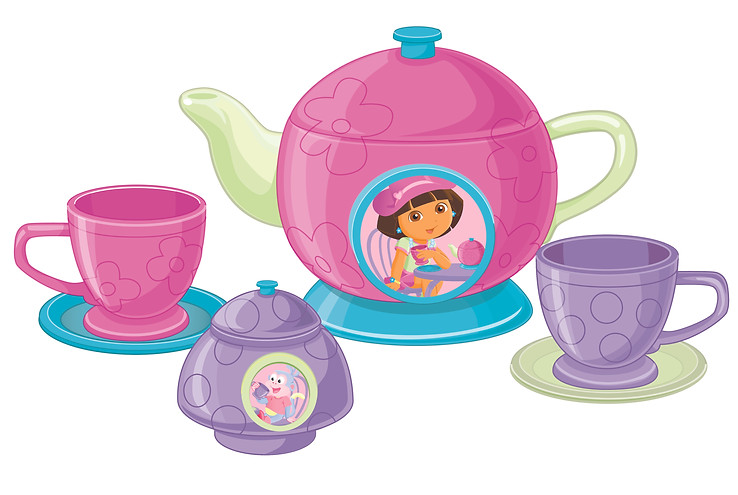
Soft Color Palette
The pinks, purples, greens
and blues are supposed to
evoke the feeling of
a garden party.
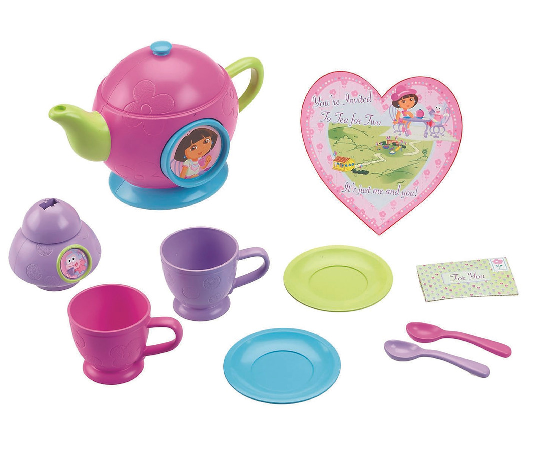
Refresh of the Tea Set
by itself
Summary
I created a low cost piece to this play-set that gives a little added play value, while refreshing the colors and the label art.
Project Goals
Solving Problems
The tea set needed a recolor of the illustrator art and invitations.
The graphics needed to be redone, and the file needed to include color call outs.
Choose colors that feel more soft
Create artwork that feels more pretend and "garden party fancy"
Design a dieline and artwork for
a brand new invitation concept.
Approach
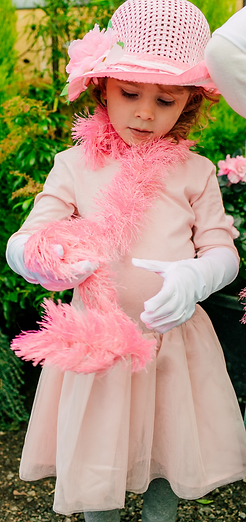
I researched what it looks like at
garden parties, what the style guides that existed for Dora already included and built a look based on this data.

Research Methods

Market Research Analysis

Recoloring/Designing Graphics
Building Dielines
Customer Mindset
Friends who Pretend
Jennifer & Becky
"We love to get dressed up
and have tea with our babies"
Both girls dress up in their mom's clothes and pretend to serve their dolls tea.
Market Research
Here are a selection of
Tea Sets already in the market.
 |  |  |  |
|---|---|---|---|
 |  |
Dielines and Artwork of Invitation

This is how
the invitation folds
Print Color Palette
Color Refresh and New Deco Labels of Tea Set

Learnings
Put yourself in their Position
Empathizing with your user
can result in work
that feels authentic.